

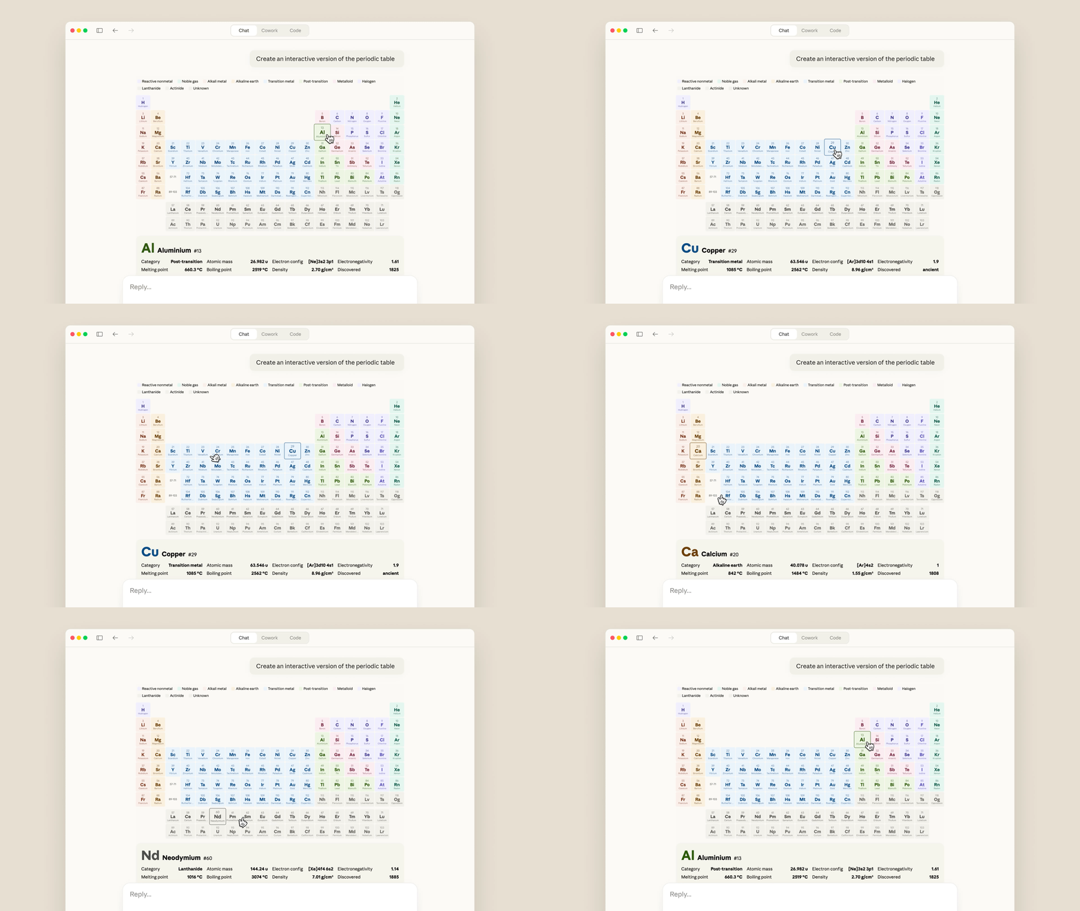
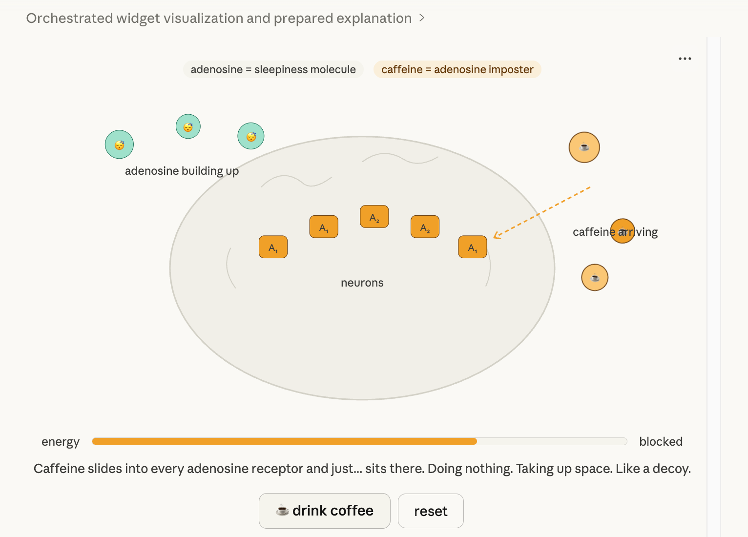
While ChatGPT still explains things with text, Claude immediately creates a real-time dashboard where clicks, hovers, and sliders work within the chat window. With the March 2026 update, interactive HTML + SVG + JS charts and diagrams will be generated inline within the claude.ai chat window. All of the screenshots below were generated directly from the claude.ai chat window. If you paste the content below exactly into claude.ai, the result will appear within seconds. If you copy and paste one of the prompts above, the result will appear within a few seconds. Please leave a review in the comments about what kind of visualization you created.
Visualization
2026.03.13 Claude draws interactive charts and diagrams right during the conversation.
The moment I finished the sales analysis in just 30 seconds, I really thought, “This is AI.”1 Claude What is inline visualization?
Unlike existing Artifacts, real-time hover, click, and parameter manipulation are all possible.
Claude: “I’ll just show you the picture right away.”2 Actual output example — Results generated by claude.ai

3 3 Practical Prompts You Can Copy and Paste Right Away
Sales Dashboard (Essential for Office Workers) Please create an interactive bar chart + line chart for the following sales data.
Data: January 5.2 million won, February 6.8 million won, March 9.2 million won, April 12.5 million won
Please compare the target values as 6 million, 7 million, 9 million, and 11 million won, respectively.
The title is 'Monthly Sales Trend'. Please make the exact numbers and percentages appear on hover.
Budget allocation pie chart Please create an interactive pie chart of our team's budget allocation.
Marketing 35%, Development 40%, Sales 15%, Operations 10%.
When clicked, a detailed description of the corresponding department pops up, and
Please title this 'Budget Allocation by Department'.
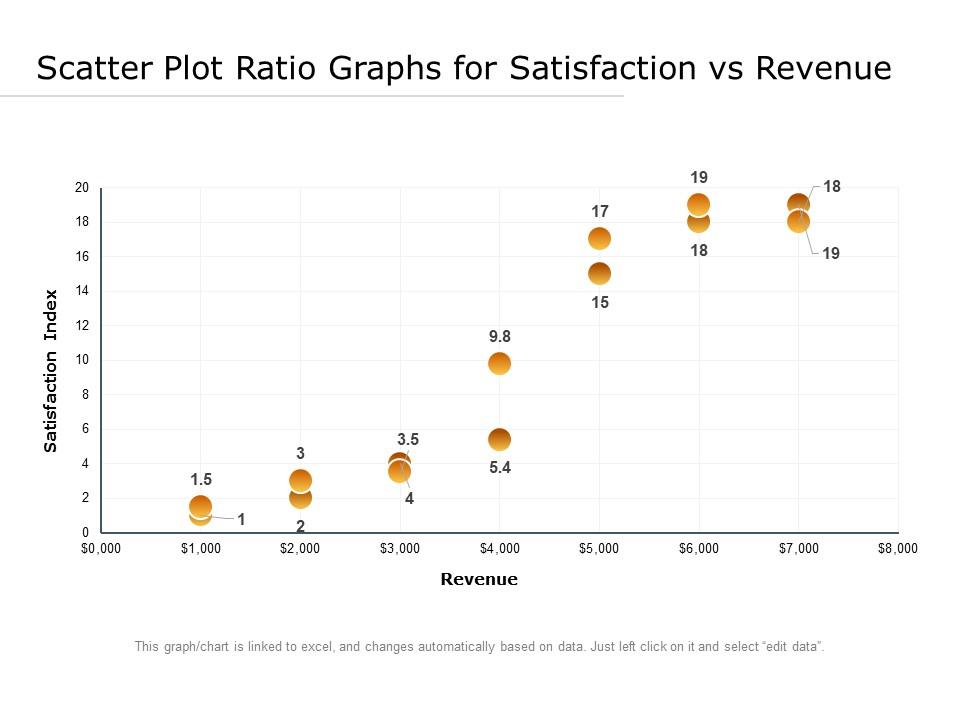
Investment Correlation Scatter Plot Draw an interactive scatter plot of the expected rate of return based on the investment amount.
Created a 12-point example that displays the investment amount, return on investment, and estimated ROI upon hovering.
Please add a trend line as well. Set the title to 'Correlation between Investment Amount vs. Rate of Return'.
4 Usage by Job Category — Points for Exploding Productivity
5 Pro Tips
Adding "dark mode로" or "SVG export 가능하게" to the end of the prompt produces more sophisticated and useful visualizations.
If you need a complex dashboard, add "interactive dashboard로 보여줘" . Test it out yourself at claude.ai now
How this content was produced
Aleph's research AI agent assisted with collecting and analyzing public data, creating charts and visuals, and structuring the draft. Davar personally reviewed and edited the sources, figures, reasoning, and final conclusions.
This content is for informational purposes only and is not personalized investment advice or an individual stock recommendation. Read the full disclaimer

Davar
Davar builds and operates Aleph's research AI agent and writes and reviews analysis on macroeconomic developments and AI industry trends.

© Aleph. All rights reserved.